One of the most exciting parts of planning an event is watching the vision take shape. Before the tables are set, before the flowers arrive, and before the first guest walks through the door, there is often one decision that quietly brings the entire event to life: the colors.
Color does more than make an event look beautiful. It helps create the mood, define the atmosphere, and shape the overall feeling guests experience the moment they enter the room. Soft colors can make a space feel romantic and intimate. Bold colors can make it feel lively and celebratory. Deep, rich tones can create an elegant, dramatic effect. Even when guests do not consciously think about the color palette, they feel its impact.
That is why choosing the right colors for your event matters so much. It is not simply about picking shades you like. It is about creating a visual story that supports the purpose, tone, and personality of the event you are planning.
Start with the Feeling You Want to Create
Before choosing a single color, ask one simple question: How do I want this event to feel?
Do you want the event to feel elegant and timeless? Warm and intimate? Fun and playful? Romantic and soft? Clean and modern? Luxurious and dramatic?
Color should support the event’s emotional tone, not just its appearance. A baby shower may call for soft, joyful, and welcoming colors. A retirement celebration may feel warm, polished, and meaningful. A corporate event may need colors that feel professional, refined, and aligned with the company’s brand. A wedding may lean toward romance, softness, or timeless sophistication, depending on the couple’s vision.
When you begin with the feeling rather than the color itself, the palette becomes much easier to build.
Should You Choose the Venue First or the Colors First?
This is one of the most common planning questions, and the answer depends on how strong your vision already is.
If you have a very specific color palette in mind, it may make sense to choose your colors first, then look for a venue that complements them. For example, if you are dreaming of a soft blush, ivory, and champagne wedding, a venue with warm neutrals and natural light can beautifully support that vision. If you want bold jewel tones and dramatic elegance, you may prefer a venue that feels rich and elevated rather than airy and minimal.
On the other hand, if the venue itself has a strong personality, it is often wiser to choose the venue first. Some spaces already come with built-in design elements that will influence your palette, such as wall colors, carpet, lighting, wood tones, chandeliers, exposed brick, or dramatic drapery. Fighting against the venue’s existing look can make decorating harder and more expensive. Working with it often creates a much more cohesive result.
Keep the Palette Simple
One of the biggest mistakes people make when choosing event colors is using too many.
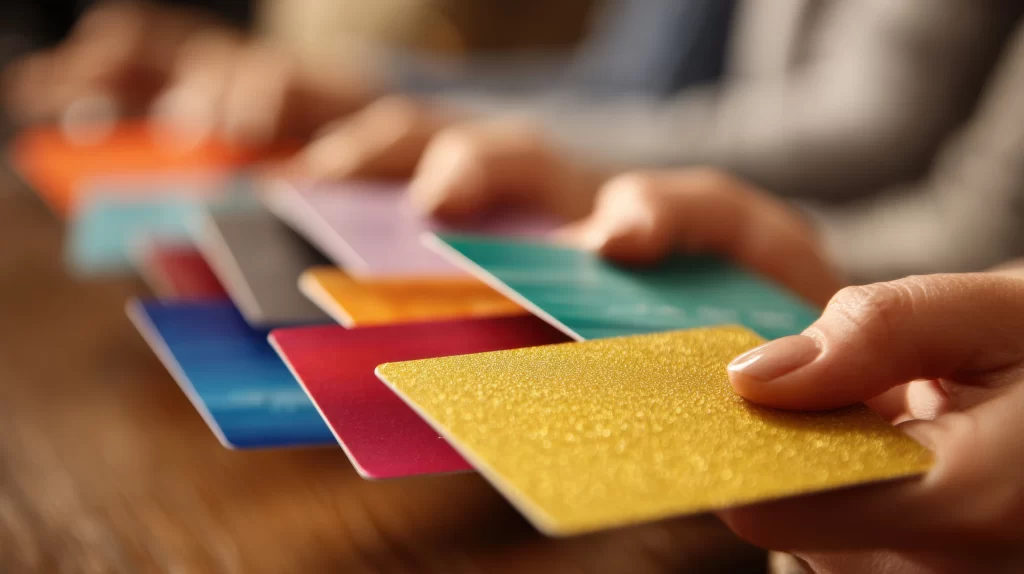
A strong event palette usually does not need six or seven competing colors. In most cases, the most polished events are built around a simple, balanced combination, such as:
- one main color
- one supporting color
- one accent, metallic, or neutral
This creates enough variety to keep the design interesting without making the event feel visually overwhelming. Neutrals such as white, ivory, cream, champagne, taupe, black, or soft gray can also serve as grounding colors, allowing your main palette to stand out without competing.
Sometimes, greenery, natural wood, or metallic details can also be part of the palette, adding texture and richness without introducing unnecessary clutter.
Let the Season Guide You
The season can be a beautiful starting point for choosing event colors because it already provides a natural mood to work with.
Spring often pairs well with fresh, airy palettes such as blush, sage, lavender, pale blue, butter yellow, and soft peach. Summer allows for brighter, more energetic combinations like coral, turquoise, fuchsia, citrus tones, and tropical greens. Fall naturally lends itself to warmth and richness, with tones such as rust, terracotta, burgundy, mustard, deep green, and warm neutrals. Winter events often feel beautiful in jewel tones, crisp whites, deep navy, emerald, plum, black, silver, or gold.
That does not mean you must follow seasonal colors exactly, but it can be a helpful guide when you are unsure where to begin.
Think About the Type of Event
Not every event calls for the same visual energy. The color palette should suit the occasion.
A wedding may call for romance, elegance, softness, or timeless beauty. A milestone birthday may invite more personality, boldness, or glamour. A corporate event may need a palette that feels polished, brand-aligned, and professional. A repast or memorial gathering may call for calm, understated tones that feel respectful, comforting, and dignified.
Color need not be loud to be impactful. Sometimes the most meaningful events are those where the palette quietly supports the atmosphere rather than trying to dominate it.
Consider More Than Just Decor
When people think about event colors, they often focus only on balloons, florals, or table linens. But a successful palette should work across the entire event experience.
Think about how your colors will appear in:
- Invitations and Signage
- Table Settings and Linens
- Florals and Centerpieces
- Attire Or Accessories
- Lighting
- Cake Or Dessert Displays
- Lounge Furniture Or Draping
- Branded Materials For Corporate Events
The more thoughtfully the palette is carried throughout the event, the more cohesive and elevated the final result will feel.
Common Color Mistakes to Avoid
Even beautiful colors can create problems if they are not used intentionally.
One common mistake is choosing colors without considering the venue. Another is selecting shades that look great online but look completely different under event lighting. Too many competing colors can make the event feel busy, while overly trendy palettes can date it quickly.
Another mistake is forgetting about balance. Bold colors often work best when paired with neutrals or softer supporting tones. Metallics can add sophistication, but too much shine can be distracting. Dark colors can feel elegant and dramatic, but without the right lighting or contrast, they can make a room feel heavy.
The goal is not just to pick beautiful colors. It is to create harmony.
The Best Color Palette Is the One That Feels Like You
At the end of the day, your event colors should reflect your vision, taste, and the experience you want to create.
Trends can be helpful for inspiration, but they should not overrule what feels right for your event. If you love soft neutrals, that is enough. If you want rich jewel tones, that is enough. If you want a room filled with warm blush, ivory, and candlelight, or a celebration full of vibrant color and joyful energy, that is enough, too.
The most memorable events are not the ones that perfectly copy someone else’s vision. They are the ones that feel intentional, personal, and beautifully aligned with the people they celebrate.
Final Thoughts
Choosing the right colors for your event is about more than matching napkins and flowers. It is about creating a mood, shaping an atmosphere, and bringing your vision to life in a way that feels thoughtful and complete.
At Here2Serve, we believe event planning is about more than logistics. It is about helping people create experiences that feel meaningful from beginning to end. Color plays a powerful role in that experience.
So if you are planning an event and trying to decide where to begin, start with the feeling you want to create. Let that guide your palette, and let your palette help tell the story of your celebration.
Sometimes, the right colors do more than decorate a room.
They set the tone for the memories made inside it.